Comparing Open Source Fonts – Part 2
Dec 19 2022
The web has been alive with discussion on web fonts after yesterday’s announcement of the Google Font API. I wrote about it myself yesterday and here is just a quick sample of some of the more interesting articles and discussions:
- Real Fonts and Rendering: The New Elephant in the Room – Jeffery Zeldman, 24 Ways
- Google getting into the Web Fonts game? – Typophile Discussion
- Details on the new Google Webfont API – Paul Irish
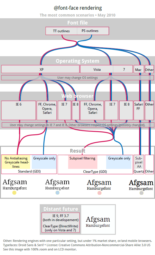
- @font-face rendering flow chart – Typophile Discussion
Yesterday I commented on the legibility of the fonts in Google’s Font Directory on Windows with ClearType turned on. After seeing Miha’s awesome font rendering chart, I can see that my run down of Windows font rendering is only partially correct: Windows XP on default renders in “standard” mode which allows for a limited anti-aliasing smoothing but only at large font sizes or for fonts with proper Windows hinting—unless you are using IE6 and then no anti-aliasing occurs and it’s pixels, pixels, pixels.
As Zeldman points out there are more issues between browsers as well, with each browser handling font hinting a little differently, but that’s a mess I’m not about to get into. What I will do is expand my review of Windows font rendering to cover what it looks link with standard mode and no anti-aliasing. Also for your convince, I’ve added screenshots showing what it looks like with each mode (each font name links to it’s corresponding screenshot):
Windows ClearType
Vista, Windows 7, Windows XP with IE7/8, XP with ClearType turned on
| Font | Best at or above | Ugly at | Illegible at |
|---|---|---|---|
| [Cantarell](/images/google-fonts/cleartype-00.jpg) | 14px | 12px | 11px |
| [Cardo](/images/google-fonts/cleartype-01.jpg) | 18px | 14px | 12px |
| [Crimson Text](/images/google-fonts/cleartype-02.jpg) | 21px | 18px | 12px |
| [Droid Sans](/images/google-fonts/cleartype-03.jpg) | 12px | 8px | 8px |
| [Droid Sans Mono](/images/google-fonts/cleartype-04.jpg) | 12px | 8px | 8px |
| [Droid Serif](/images/google-fonts/cleartype-05.jpg) | 12px | 11px | 8px |
| [IM Fell](/images/google-fonts/cleartype-06.jpg) (depends on the version) | 30-24px | 21-18px | 14-12px |
| [Inconsolata](/images/google-fonts/cleartype-07.jpg)\* | 30px | 24px | 14px |
| [Josefin Sans Std Light](/images/google-fonts/cleartype-08.jpg) | 36px | 24px | 16px |
| [Lobster](/images/google-fonts/cleartype-09.jpg) | 24px | 11px | 11px |
| [Molengo](/images/google-fonts/cleartype-10.jpg) | 24px | 12px | 9px |
| [Nobile](/images/google-fonts/cleartype-11.jpg) | 16px | 11px | 8px |
| [OFL Sorts Mill Goudy TT](/images/google-fonts/cleartype-12.jpg) | 18px | 12px | 10px |
| [Old Standard TT](/images/google-fonts/cleartype-13.jpg) | 14px | 12px | 9px |
| [Reenie Beanie](/images/google-fonts/cleartype-14.jpg) | 24px | 16px | 12px |
| [Tangerine](/images/google-fonts/cleartype-15.jpg) | 36px | 24px | 18px |
| [Vollkorn](/images/google-fonts/cleartype-16.jpg) | 21px | 18px | 14px |
| [Yanone Kaffeesatz](/images/google-fonts/cleartype-17.jpg) | 24px | 21px | 12px |
Windows Standard Mode
Windows XP default with Firefox or Chrome
| Font | Best at or above | Ugly at | Illegible at |
|---|---|---|---|
| [Cantarell](/images/google-fonts/standard-00.jpg) | 21px | 16px | 11px |
| [Cardo](/images/google-fonts/standard-01.jpg) | 36px | 30px | 12px |
| [Crimson Text](/images/google-fonts/standard-02.jpg) | 24px | 18px | 12px |
| [Droid Sans](/images/google-fonts/standard-03.jpg) | 12px | 8px | 8px |
| [Droid Sans Mono](/images/google-fonts/standard-04.jpg) | 12px | 8px | 8px |
| [Droid Serif](/images/google-fonts/standard-05.jpg) | 12px | 11px | 8px |
| [IM Fell](/images/google-fonts/standard-06.jpg) (depends on the version) | 30-21px | 21-18px | 12-11px |
| [Inconsolata](/images/google-fonts/standard-07.jpg)\* | 21px | 16px | 11px |
| [Josefin Sans Std Light](/images/google-fonts/standard-08.jpg) | 36px | 24px | 14px |
| [Lobster](/images/google-fonts/standard-09.jpg) | 24px | 11px | 11px |
| [Molengo](/images/google-fonts/standard-10.jpg) | 21px | 16px | 10px |
| [Nobile](/images/google-fonts/standard-11.jpg) | 24px | 12px | 9px |
| [OFL Sorts Mill Goudy TT](/images/google-fonts/standard-12.jpg) | 21px | 16px | 12px |
| [Old Standard TT](/images/google-fonts/standard-13.jpg) | 30px | 18px | 12px |
| [Reenie Beanie](/images/google-fonts/standard-14.jpg) | 24px | 18px | 16px |
| [Tangerine](/images/google-fonts/standard-15.jpg) | 36px | 24px | 18px |
| [Vollkorn](/images/google-fonts/standard-16.jpg) | 21px | 14px | 11px |
| [Yanone Kaffeesatz](/images/google-fonts/standard-17.jpg) | 24px | 21px | 14px |
Windows No Anti-Aliasing
Windows XP default with IE6
| Font | Best at or above | Ugly at | Illegible at |
|---|---|---|---|
| [Cantarell](/images/google-fonts/none-00.jpg) | 36px | 30px | 11px |
| [Cardo](/images/google-fonts/none-01.jpg) | 36px | 21px | 12px |
| [Crimson Text](/images/google-fonts/none-02.jpg) | 24px | 21px | 18px |
| [Droid Sans](/images/google-fonts/none-03.jpg) | 12px | 8px | 8px |
| [Droid Sans Mono](/images/google-fonts/none-04.jpg) | 12px | 8px | 8px |
| [Droid Serif](/images/google-fonts/none-05.jpg) | 12px | 11px | 8px |
| [IM Fell](/images/google-fonts/none-06.jpg) (depends on the version) | 30-21px | 21-18px | 14-12px |
| [Inconsolata](/images/google-fonts/none-07.jpg)\* | 30px | 24px | 14px |
| [Josefin Sans Std Light](/images/google-fonts/none-08.jpg) | 36px | 30px | 24px |
| [Lobster](/images/google-fonts/none-09.jpg) | 24px | 21px | 14px |
| [Molengo](/images/google-fonts/none-10.jpg) | 21px | 16px | 10px |
| [Nobile](/images/google-fonts/none-11.jpg) | 30px | 21px | 14px |
| [OFL Sorts Mill Goudy TT](/images/google-fonts/none-12.jpg) | 24px | 16px | 12px |
| [Old Standard TT](/images/google-fonts/none-13.jpg) | 21px | 14px | 11px |
| [Reenie Beanie](/images/google-fonts/none-14.jpg) | 30px | 21px | 16px |
| [Tangerine](/images/google-fonts/none-15.jpg) | 42px | 36px | 24px |
| [Vollkorn](/images/google-fonts/none-16.jpg) | 24px | 18px | 14x |
| [Yanone Kaffeesatz](/images/google-fonts/none-17.jpg) | 24px | 18px | 14px |
Again I didn’t bother creating a list for Mac. If you are working on Windows you can use Safari to see what the rendering will look like on a Mac. Macs render type in a more consistent manner: as it decreases in size at worst it becomes a little more anemic and fuzzy. In the main, if your type is legible on Windows it is legible on a Mac.
Conclusion
Now looking at all these Windows rendering styles you can see how varying typeface legibility is: some fonts behave well across all rendering like Droid and others preform only good with one type of rendering like Inconsolata, which looks good in standard mode but terrible in ClearType and with font smoothing off.
The Droid Family is the only font in this set that I would use for body text. All others are only suitable for headers or display text. And I would avoid using Inconsolata, Tangerine, Josefin, and Cardo except at really large display sizes (36px or larger).