
Comparing Open Source Fonts
Dec 19 2022
Oh what a happy day to be a Web Developer! Google has released their Google Font API and the Google Font Directory with a number of Open Source Fonts. Also released in cooperation with TypeKit is the WebFont Loader which helps the FOUT (Flash of Unstyled Content) which is an issue with how Firefox handles downloaded fonts ( for more on FOUT and why WebLoader is a good thing see Paul Irish’s Details on the New Google WebFont API).
All this is great as it make it a snap to use open source fonts, either the one’s Google hosts (fast download! easy!) or you use WebFont Loader to make it simple to add other Open Source Fonts such as some of the great ones offered by The League of Movable Type. If there are licensed fonts you want to use, I recommend looking into TypeKit‘s services.
CrossPlatform Rendering Issues in a NutShell
So now that the issue of web fonts is more or less solved, the next big issue is cross-platform font rendering. The best way to sum up the difference :
Mac: the goal of font rendering is to preserve the design of the typeface as much as possible, even at the cost of a little bit of blurriness.
Windows ClearType (Vista,Windows 7, anyone using IE7/8, and XP users smart enough to turn on ClearType): the shape of each letter should be hammered into pixel boundaries to prevent blur and improve readability, even at the cost of not being true to the typeface. It is up to the font designers to build ClearType hinting into the font—without it the font may become illegible at small sizes.
Windows no anti-aliasing (XP default): pixels, pixels, pixels.
much of the above was paraphrased from a great post by Paul Irish: Font Rendering: Respecting The Pixel Grid
In practice this means that Windows users tend to think type on a Mac looks blurry and Mac users think that type on Windows looks jagged and crappy. Also, and more important is that a font needs to be hinted for Windows ClearType renderer or else at sizes under 20px it becomes ugly and often illegible at smaller sizes.
For a more detailed breakdown of how fonts are rendered check out this awesome font rendering chart by Miha.
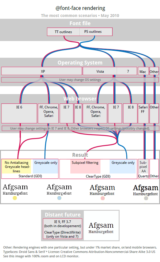
What does this mean for the typefaces in the Google Font Directory?
So if you are a Mac user without a Windows box around you’ll mostly want to know which fonts are ugly/illegible at small sizes. I’ve taken a brief look at the fonts Google offers on my Windows PC here at work and came up with the following list. Note that some of these typefaces are meant as display only so they shouldn’t be used small anyway:
UPDATE: for a more complete chart with screenshots including Windows Standard Mode and no anti-aliasing check out Comparing Open Source Fonts – Part 2
Open Source Fonts Appearance With Windows ClearType
| Font | Best at or above | Ugly at | Illegible at |
|---|---|---|---|
| [Cantarell](https://code.google.com/webfonts/family?family=Cantarell) | 14px | 12px | 11px |
| [Cardo](https://code.google.com/webfonts/family?family=Cardo) | 18px | 14px | 12px |
| [Crimson Text](https://code.google.com/webfonts/family?family=Crimson+Text) | 21px | 18px | 12px |
| [Droid Sans](https://code.google.com/webfonts/family?family=Droid+Sans) | 12px | 8px | 8px |
| [Droid Sans Mono](https://code.google.com/webfonts/family?family=Droid+Sans+Mono) | 12px | 8px | 8px |
| [Droid Serif](https://code.google.com/webfonts/family?family=Droid+Serif) | 12px | 11px | 8px |
| [IM Fell](https://code.google.com/webfonts/list?family=IM+Fell) (depends on the version) | 30-24px | 21-18px | 14-12px |
| [Inconsolata](https://code.google.com/webfonts/family?family=Inconsolata)\* | 30px | 24px | 14px |
| [Josefin Sans Std Light](https://code.google.com/webfonts/family?family=Josefin+Sans+Std+Light) | 36px | 24px | 16px |
| [Lobster](https://code.google.com/webfonts/family?family=Lobster) | 24px | 11px | 11px |
| [Molengo](https://code.google.com/webfonts/family?family=Molengo) | 24px | 12px | 9px |
| [Nobile](https://code.google.com/webfonts/family?family=Nobile) | 16px | 11px | 8px |
| [OFL Sorts Mill Goudy TT](https://code.google.com/webfonts/family?family=OFL+Sorts+Mill+Goudy+TT) | 18px | 12px | 10px |
| [Old Standard TT](https://code.google.com/webfonts/family?family=Old+Standard+TT) | 14px | 12px | 9px |
| [Reenie Beanie](https://code.google.com/webfonts/family?family=Reenie+Beanie) | 24px | 16px | 12px |
| [Tangerine](https://code.google.com/webfonts/family?family=Tangerine) | 36px | 24px | 18px |
| [Vollkorn](https://code.google.com/webfonts/family?family=Vollkorn) | 21px | 18px | 14px |
| [Yanone Kaffeesatz](https://code.google.com/webfonts/family?family=Yanone+Kaffeesatz) | 24px | 21px | 12px |
Open Source Fonts Appearance With a Mac
You’ll notice that I haven’t compiled a table like I did for Windows. That’s because Mac font rendering stays true to the font; thus, you can assume that display type fonts look bad at small sizes and fonts made for body text are good down to at least 12px. Also if you are on a Windows box you can easily see what it looks like on a Mac: Download Safari and turn on it’s font smoothing (Preferences > Appearance > Font Smoothing > Light or Medium) which makes the font rendering behave (mostly) like a Mac.
*Inconsolata is a good example of a font not hinted for ClearType which looks ugly on Windows below 24px and becomes illegible at 14px; however, on a Mac it looks good even at 11px.